The Home Page

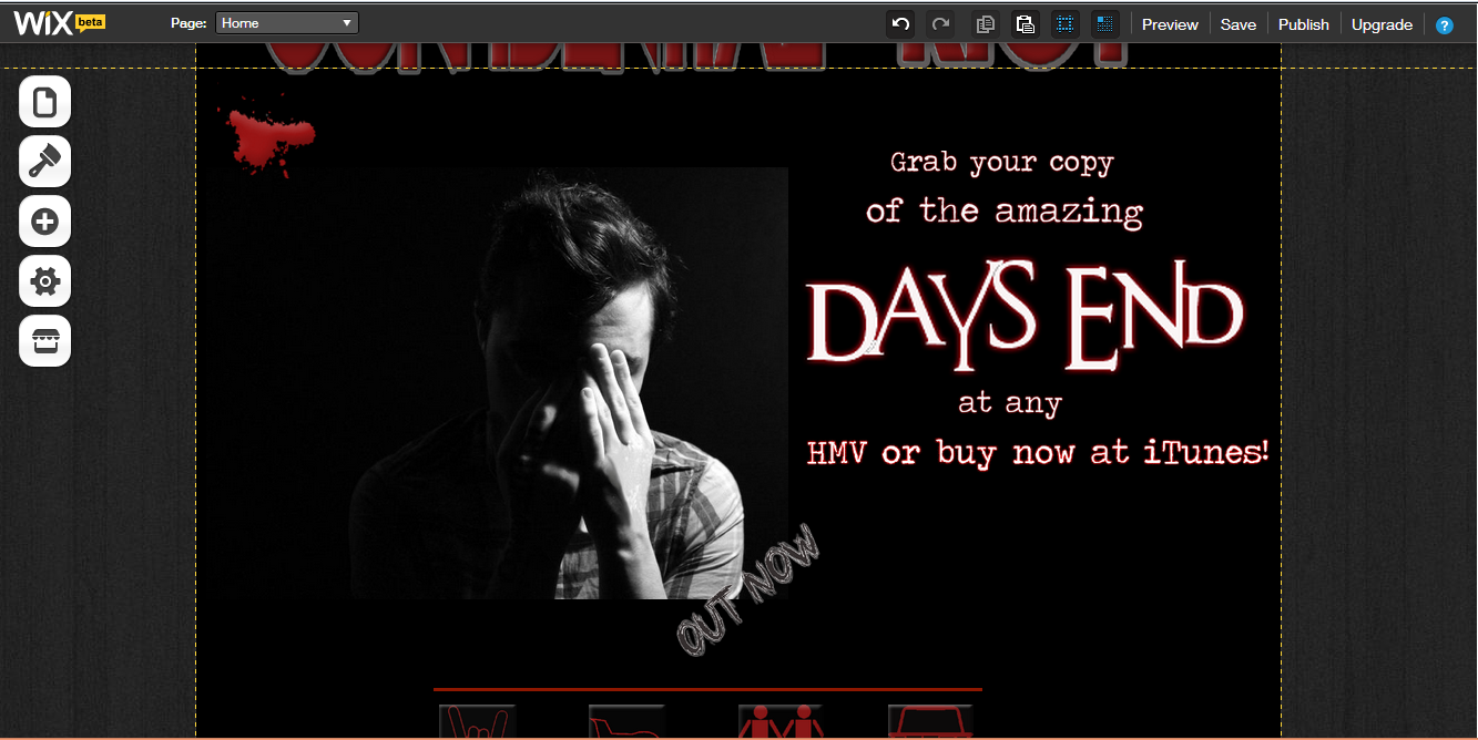
The first aspect I considered was the background colour when looking into the home page, I chose black to continue the typical colours of my genre. I then added a title in the same typeset as my enter page and colour. Once again this was to add consistency and enable the audience to establish a connection between the artist and the genre as this typeset is one typical of the alternative rock gene. I then added stains to show the audience the rebellious attitude my artist would like to portray.
 I then had to add the icons to direct the audience to the page they want. When looking on 'All time low' 's website I saw they had used icons to represent different aspects of their page. I thought that this was an interesting feature that added to the simplistic design I was aiming for; with this in mind I then added line drawings as button. I did this to follow the conventions of websites of my genre.

Inspiration
These are the icons that inspired me to create my icon when directing the audience to the page they want. This is from 'All Time Lows' website.
No comments:
Post a Comment