Thursday, 2 May 2013
Wednesday, 1 May 2013
Ancillary Task - Website
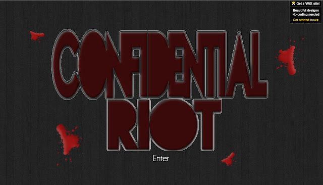
Please follow this link to access my website for Confidential Riot. http://philippamclarke.wix.com/confidentialriot#
Tuesday, 30 April 2013

Thursday, 4 April 2013
Wednesday, 3 April 2013
Evaluation 2
How effective is the combination of your main product and ancillary texts?
A successful product and artists rely on a certain looks or logos that become a feature associated with their band. This is why it important for all my products to link together as they should establish a 'look' like real media products.
My ancillary task works extremely effectively with my music video, I feel. This is because each product are linked by specific conventions, that I chose to keep the same for consistency.
For example, I used the conventional colour pallet in both ancillary tasks and my music video; as I used 'black' for my background on my website and 'red' for the writing in on my advertisement. To link these to my music video, I then used mise-en-scene to express the colour pallet e.g black background.
I also felt they worked as my artist appeared in all three. This means that the figure in all three media products matched, so an audience could easily associate the artist with his product. I also felt that the character in each product represented the 'Alternative Rock' genre effectively has he fitted the stereotypical look of someone who sing/listens to my genre.
The only thing I feel that doesn't work effectively, is the use of distortion in the music video but not in my ancillary tasks. This doesn't create a constant theme, however, the audience could view it as a reflection of the song rather than the artist as a whole.
Saturday, 9 March 2013
Evaluation 3 -Audience Feedback #Advert
Audience Feedback On My Advert.

To get audience feedback on my advert I posted a picture on Facebook; which allowed my family and friends to comment what their feeling were about the photo and help me improve the advert. The comments were complimentary and confirmed how I felt about the contrasting colours which related to the genre. It also enabled me to get comments from a variety of subjects such as how the photography works with my advert.
However, the constructive criticism was the most useful like the comment advising to enlarge the fonts at the bottom, although I felt the comment was justified and helpful I chose to keep the font the same size; as on other posters, like ones related to my genre, had the sponsors small and barely noticeable therefore, I felt by changing this the conventions wouldn't be like the 'Alternative Rock' genre and relating to a professionally product.
Another element I had noticed that could be improved with my advertisement was the website not being in the centre, however, if I had moved this along the font in the white that was contrasting then becomes hard to see and if I used half white and black I feel that it would not create the contrasting impact that I initially aimed for.
Evaluation 3 -Audience Feedback #Website
Audience Feedback On My Website
To get a wide variety of feedback I asked a different age range to give feedback on my website as this would allow me to get several different views on my media product.
This feedback was productive as I realised the the aim of trying to maintain consistency had worked as most of the feedback commented on how the site links to the genre.
The feedback that suggested the sides should have some advertisement down the side was inspiring as it was something I had tried to explore, initially I had paint splats down the side but I felt that it looked too messy and organised but the idea of having advertisements was inspiring and something I would have considered if I had more time.
The comment on the banner was a shock to me as it was something that I had not considered and hearing that from someone else's perspective that it was "boring" was interesting. To avoid this in the future I think that I would add some more clip art that related to the genre. This would spice the banner up but still link to 'Alternative Rock Genre'.
The constructive criticism concerning the photographs+ and how dark they are was very helpful as that's something that I would want to change straight away. To do this I would only alter the lighting a small amount on each photo. The lighting should be around the same to create consistency and depending on the photo I may lower the contrast levels.
Subscribe to:
Posts (Atom)