Saturday 29 December 2012

Website #Bio

The Bio Page


To start my bio page I first added the name of the artist. I did this because when I was researching into website the band/artists name was always at the top so I decided to also add this feature. I added the name in the same typeset and colour to make my website seem organised and adds consistency. I then added a black long box where my information will go. I did this as a way to highlight the information and separate it from what other aspects that might be added onto the page.


My next step was to add all the information in the boxes.I made the typeset small as this was a common feature that I had noticed on other websites. It also allowed me to fit in lots of information on my artist; giving the audience more information. The colours I chose to put my typeset in were red and white, I did this as both colours contrast against the black box. My aim of this would be to create an impact. 


The next thing I did was to add different boxes along side of the main box. In these boxes I will add information about the artist with 'albums' 'influences' 'favourite charities' and 'quick facts'. I have put these in so the audience can select and find information they want quick and easily. 


One of the boxes had my artist influences in. For these I chose Simon Neil the lead singer in Biffy Clyro, Jared Leto in 30 seconds to mars and Sam McTrusty the lead singer of Twin Atlantic. I have chose these because they are all lead singers of alternative rock bands and would be people who inspire my artist.


Another box was of my artists favourite charity, I had noticed this feature on Paramore's website and used it as I believe it gives a personal connection between the artist and the audience. It help the audience get to know the artist and his beliefs.

In this box I put simple information that the audience would most likely want to know. I did this as it allows the audience to find this information quick and and easy, rather than searching through the main information. I found this feature to be useful  as it summaries my artist.


The final things I did was add the album covers and a picture to represent him. The album covers where previous picture I had and added the album names and artist name so the album seems personal. The picture is a direct address this engages the audience and creates the impression they know 'Sam'. 


Sunday 23 December 2012

Website #Tour Dates

Tour Dates Page


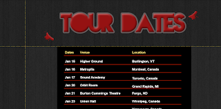
 When looking at other artists of my genres websites an aspect that I noticed was common were that boxes of a dark colour was used so I decided to use the same feature.

 
Before editting the box more, I decided to add the title. When doing this I considered consistancy and therefore used the same style and colour writting that I had previously used on store and the enter page.  I feel the consistant typeset would add a realistic look and constantly reminds the audience what genre it is. I also put the red stains on the page to reinforce the rebellious attitude. The next step I took was changing the background. I chose the same background as the enter page and the store page this also creates consistancy; which I feel is needed when creating a website of this genre. 
 
 
The box I had before, I felt, was to childish for my genre. I changed the box to a simple black one with red lines toseprerate information. For inspiriation I used All Time Lows webiste who also used this feature. However, to differ from then add a unique style I chose different colours that I felt represented my artist more. I also used the dates and venues from the All Time Low website. The reason I did this was to get a realistic view on what the artists schedule would be. Another aspect I found common was the layout of the 'date' 'venue' 'location' and 'ticket' then an RSVP response, so I used inspiration from both All Time Low and We The Kings and added this feature.
 
 
INSPIRATION


I used these to pages that are both from my genre as inspiration. I have used the feature of the RSVP button, to enable the band to be shared on social networking account and therefore raise awareness of them. I have also used the style of box and lines to make my page look more professional.
 

Saturday 22 December 2012

Website #Store


The Store Page


  The first thing I did when considering the 'store' page of my website was to create products to go on it. To make the page have a more realistic feel I ccessed a website on google which allowed me to create my own clothes. I then created a variety of clothes I observed on other band websites and followed there style. After making them I took screen shots and created a slide show to give the impression that the audience could chose what colour clothing they want. I felt these aspects gave the 'store' a realistic look. I then lined them up in a way that I had seen on websites of my genre and in a way that still created a simplistic style.

I then added prices. The price and discription I made grey to continue the dark colours, that are the theme of my genre. The prices I chose followed the prices that I had previously seen on website whilst doing my research; I did thhis to keep the store realistic.


An feature that is important is the title. I wanted the title to be large and to stand out; to create an impact on the audience, yet, stick to my genre. To do this I used the same font as the title screen and placed it in red at the top and in the center of the page; by doing this it should grab the audience attention straight away. When looking on the paramore website I wsaw that they had a sale. In order to make my website store like others Ihad researced into I decided to add a winter sale. I put this in white typeset as white connotes snow and winter. The colour also contrasts with the black background. Another feature I added to allow my website to have consistancy was the red stain around the website; like on my enter page. This not only creates the sense of consistancy it also reinforces the sense of a rebellious attitude.

Website #Home page

The Home Page


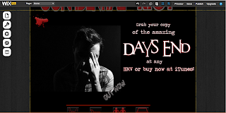
 The first aspect I considered was the background colour when looking into the home page, I chose black to continue the typical colours of my genre. I then added a title in the same typeset as my enter page and colour. Once again this was to add consistency and enable the audience to establish a connection between the artist and the genre as this typeset is one typical of the alternative rock gene. I then added stains to show the audience the rebellious attitude my artist would like to portray.


I then  had to add the icons to direct the audience to the page they want. When looking on 'All time low' 's website I saw they had used icons to represent different aspects of their page. I thought that this was an interesting feature that added to the simplistic design I was aiming for; with this in mind I then added line drawings as button. I did this to follow the conventions of websites of my genre.
 In the space left I plan to add an album cover, as this was an aspect that I found was common on websites of all genres. I also found this would be a great way to advertise the song to the audience and it gives them the option to buy the album.

The final thing on my home page was to add the album and advertise it. For this I used a typewriter typeset. This is a simplistic style and clear enough for the audience to read and recognise the information. 'Days end' the album name is in a different font, this adds emphasis on the album title and grab the audience attention. I also added 'out now' in a different typeset and colour meaning that it didn't distract from the more  important information but shows that its something the audience should look at.


Inspiration
These are the icons that inspired me to create my icon when directing the audience to the page they want. This is from 'All Time Lows' website.

Tuesday 11 December 2012

Website #enter page

When considering creating a website I first found a reliable site that allowed me to, therefore I used Wix. 
Once on Wix I chose a template I thought once edited would look appropriate to my genre and create an impact. 
 

1. This is the template I chose, when looking at the placing of the pictures I could imagine pictures of my artist and the simple layout resembled ones that I had looked at originally when doing research.

2. I then changed the background to black. I did this as it is the colour most appropriate to 
genre and matches the attitude that my artist would portray. I also felt that the black would enable the other colours to stand out more; making more of an impact.
 
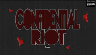
3. My next step when creating my website was to delete all the boxes and picture to have a clear black back ground. When looking at other band websites of my genre a common aspect was a page with large writing or a symbol on to lead you into the actual website (For example, 30 seconds to mars and paramour website use this feature). This inspired me to do add this feature on my website. To do this I took the large font of my advert and pasted this on to the 'enter' page. I did this to create a sense of consistency and a professional look.
 
 
4. When looking at the background I thought it looked slightly dull and a page of my genre would at least have some effect, with this in mind I then chose a grey background that looks like a dirty wall/metal. I also felt that the page looked plain and needed some features to exaggrate the 'rebellious' theme. To improve on this I added different sized paint stains; this was to reinforce the sense that my artist has a subdersive attitude. However, I still thought that the page didn't create enough impact and decided that making the words 'Confidential Riot' flash would make the words stand out. Finally, I linked both 'Confidential Riot' and the word 'Enter' to the home page.
 
 
Inspiration for my choice


This was my inspiration for the 'Enter Page'. The 30 Seconds To Mars website uses a singal feature and added a spinning animation to it.  I liked the feature and tried to add animation to my product but having a flash animation. These I feel grab the audience intrest and give the audience a specific idea of what genre the artist is.