
Target Audience- 40+
Main Colour Pallet- Cerise, black and brown
The central image is of the female protagonist lay provocativly on the bed, looking away from the camera. This is the artist album cover.
The background behind the album cover is a blurred sheet effect; which is also cerise and black, keeping consistancy with the colours.
Above the central image there are three lines of writing. The first line is the albums name in a artistic typeset. The line below that is simply a line that lets the audience know the name below is the name of the singer. The third line is the name of the artist 'Diana Krall' this is in fancy typeset. This is done to add importance.
The second, forth and sixth lines that are below the album cover are also in a bold typeset; once again highlighting importance to the audience.
The first second and third lines are simpler, as they arent as important, they are just introducing what the information stated on the next line would be.
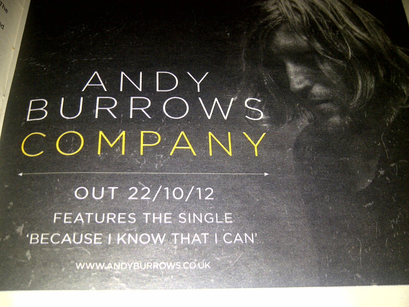
Main Colour Pallet- Black, yellow and white
The central image is a plain black background with the artists image to the right, in black and white; by doing this it adds dramatic effect.
The first and second lines are the artists name in a simplistic plain white typeset, this doesnt over complicate the advert and relates to it's genre.
The third line is in the same typeset but yellow. This is the albums name and allows the audience to locate the correct information quicker.
There is a small line, also following the simplistic theme, seperating the basic information from the more important information.
The same typest is used again, as it's consistant, which states the release date.
The fifth and sixth lines are providing the audience the information of what songs are featured on the album. This may allow the audience to create a link or relate to it more.
In small under the writing is the website for the artist. This enable the audience to be able to find more information if they require it.
The small icon in the right next to the artist is the record label, making assosiation from the artist to the label easy and recognisable.

Main Colour Pallet- Gold, black and white
The central image is the bands cover. Enabling the audience to identify immediantly with the band and show them what they should be looking out for if they want to buy it.
The background from the cover is used as the background on the advert. This is done to create a link and reinforce the bands attitude/atmosphere they want to create. However, it does look repetitive, therefore, I personally do not think it's effective.
Under the bands cover ther eis the name of the artist and the vinyl name. This is in a goldy brown typeset, which stick to the colour pallet relating to their chosen genre. However, it is small, which make is harder for the audience to read.
Under the basic information there are two paragraphs in small typeset that are giving in depth detail about the product trying to create an interest.
The last line are the labels assosiated with the artist.
The final line underneath a small logo pattern is the website for the artist, enabling the audience to get more information if the require.

Target Audience- 30-70
Main Colour Pallet- White blue and black
The large main picture is of the silhouette of a male dressed in a hat and a trench coat. This instantly identifies to the audience that it is for the older age range. The artist is walking alon a dull (added by effect) road, with barely any colour. However, despite the lack of colour the large amount of white means the picture is still very bright, this allows the audience to create a link between the artist and the genre.
The typeset is simplistic, so the audience can retrieve the information easily if required. It also indicates that it is aimed for an older audience as it isnt too complicated.
The artists names is in a larger typeset than the restand is in a navy blue; by doing this it exaggerates the sense of importance and allows them to spot it easier.
The information in italics is a quoted review and can be easily identified.
The information at the bottom of the page is the release date, once again the change of colour to navy blue indecates the level of importance.
Beneath this is the distribution information and enables the audience to see how to buy the product if they wish.
In a small typeset at the bottom is the artists website information, allowing the audience to access more information on and about the artist if they would like to.
The box in the bottom left corner is the record label which is linked to the band. The white box surronding this makes it easy to see.
By analysing these and seeing the convetions of the magazine adverts mine will be simplistic with artist writing with a consistant colour pallet to add a professional look.
Saved as a favorite, I really like your blog! Great post. I am facing a couple of these problems.Image Consultant Singapore
ReplyDelete